Logo

General Guideline
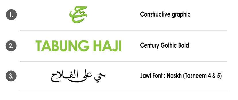
The displayed corporate logo forms the basis of the Tabung Haji brand identity. This distinctive symbol is designed to be easily recognized and remembered worldwide. The Tabung Haji symbol consists of two elements: the name Tabung Haji and the letters TaHa (تح), representing Tabung Haji’s commitment to the success of the Ummah’s economy.
The introduction of the Tabung Haji corporate logo includes the name Tabung Haji and the tagline ![]() , which translates to ‘Let’s Move Towards Success.’
, which translates to ‘Let’s Move Towards Success.’
Typography

Typography is a crucial addition to the brand identity. Consistent use of typefaces adds another element that defines the appearance of Tabung Haji. The use of Bold Century Gothic and Jawi typeface in Naskh is intended to maintain the uniformity of the Tabung Haji logo.
The typeface used in the monogram has been carefully selected for a modern yet refined style, enhanced by the use of Jawi script. The Jawi typeface, Ta Ha (تح), is created through graphics to maintain the logo's consistency.
Logo Colours

The word "Tabung Haji" in green, as shown, is the official corporate color. When the word "Tabung Haji" is in green, contrasting colors should be used, based on Pantone 376C. To give the logo a three-dimensional appearance, the monogram should be imagined in Pantone 370C.
Four process colors (CMYK) can be used in newspapers and magazine advertisements, publications, and where contrasting colors are not available. Tabung Haji (green) is produced using a mix of 50% cyan (C) and 100% yellow (Y). For guidance on the typeface from the monogram, the Ta Ha (تح) (green) is placed on 27% black (K).
Black for the Jawi font and monogram is derived from a combination of 100% cyan (C), 100% magenta (M), and 100% black (K).
Corporate Logo Variations
The following are variations of the TH Corporate Logo available for download according to usage needs:

 Facebook
 X
X Instagram
 TikTok
 YouTube
 Linkedin


