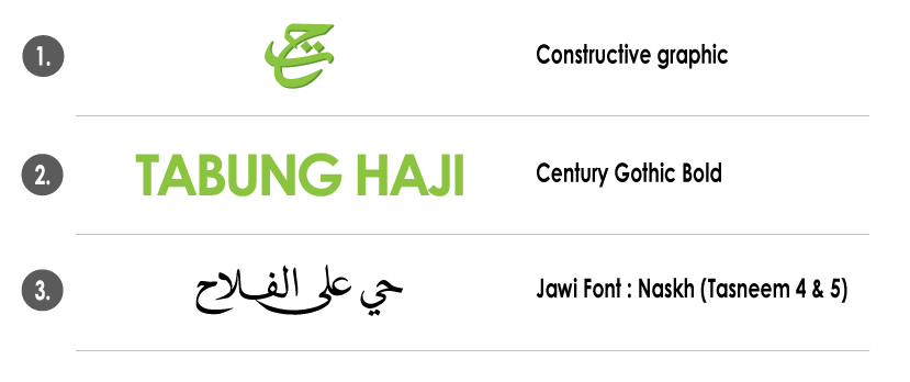
General Guideline
The displayed corporate logo is the foundation of Tabung Haji's brand identity. This distinctive symbol is designed to be easily recognised and remembered worldwide. The logo consists of two elements; the words Tabung Haji and TaHa (تح) which symbolises Tabung Haji's commitment towards the success of the Ummah's Economy.
The corporate logo boasts the name Tabung Haji and an Arabic tagline ![]() which translates to 'Let’s Hasten towards Success’.
which translates to 'Let’s Hasten towards Success’.
Typography

Typography is an important addition to the brand identity. A consistent usage of certain typefaces adds definition towards TH’s corporate identity. Bold Century Gothic and Naskh Tas jawi typefaces are used to maintain the uniformity of the logo.
The typeface used in the monogram has been carefully selected to flaunt a refined modern style and further enhanced by the use of jawi text. Jawi typeface, (تح) is specially designed to maintain the integrity of the logo.
Colors on Logo

The green as seen on the word Tabung Haji, is TH’s official corporate colour. When the word Tabung Haji is in green (Pantone 376C), the contrasting colour that should be used according is Pantone 370C. To create the embossed effect, the ‘shadow’ of the monogram should be in colour code Pantone 370C.
Four colour (CMYK) printing process may be used for newspapers, magazine advertisements, publishing purposes and if the production of the contrasting colours are not available.The name of the organisation, 'Tabung Haji' (green) is produced by a mixture of 50% cyan (C) and 100% yellow (Y). For the monogram, Ta Ha (تح) (in green) is placed on 27% black (K).
The black colour for jawi typeface and monogram is taken from a combination of 100% cyan (C), 100% magenta (M) and 100% black (K).
Variation Of TH Corporate Logo
Please find below for different versions of TH Corporate Logo for various applications :

 Facebook
 X
X Instagram
 TikTok
 YouTube
 Linkedin


